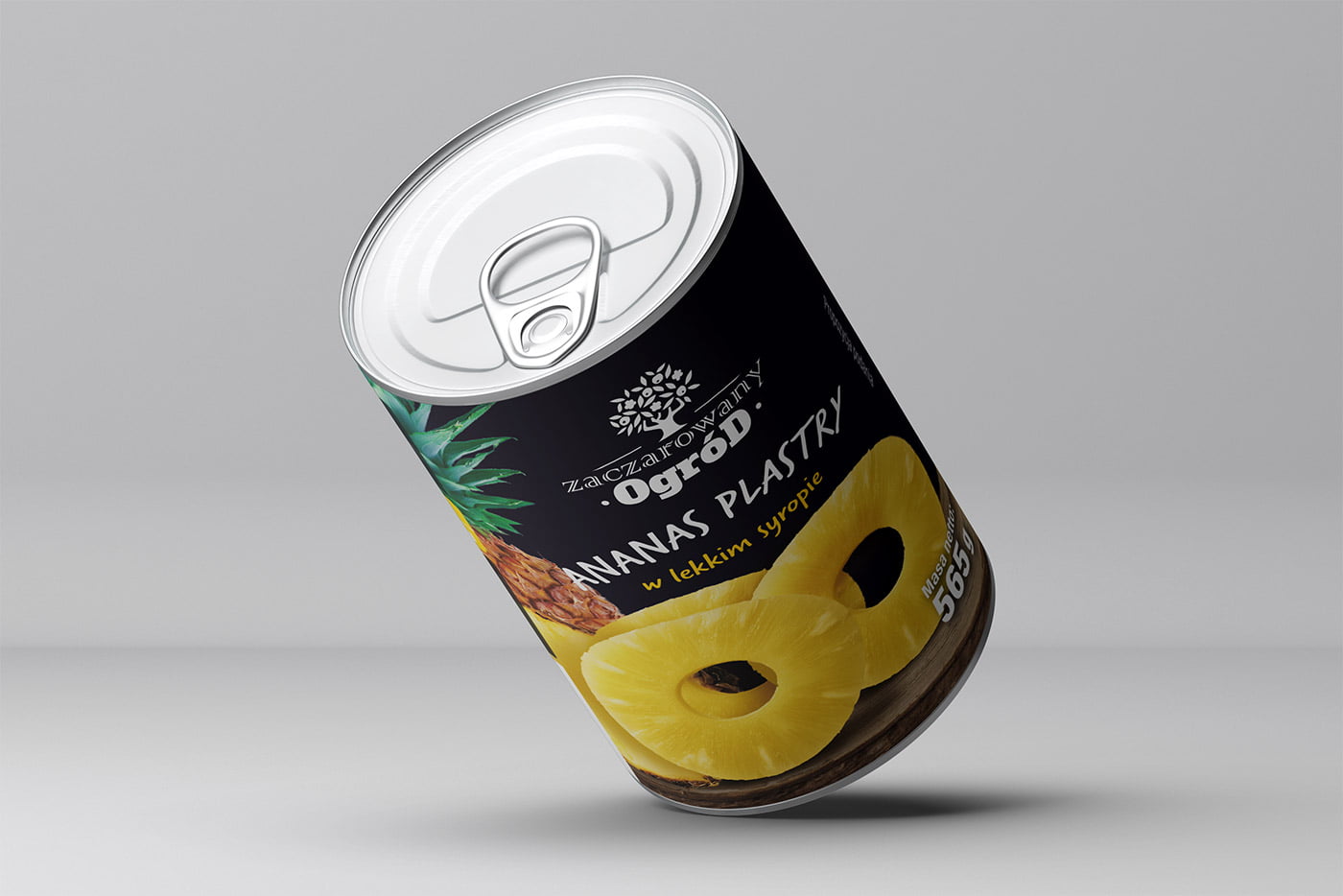
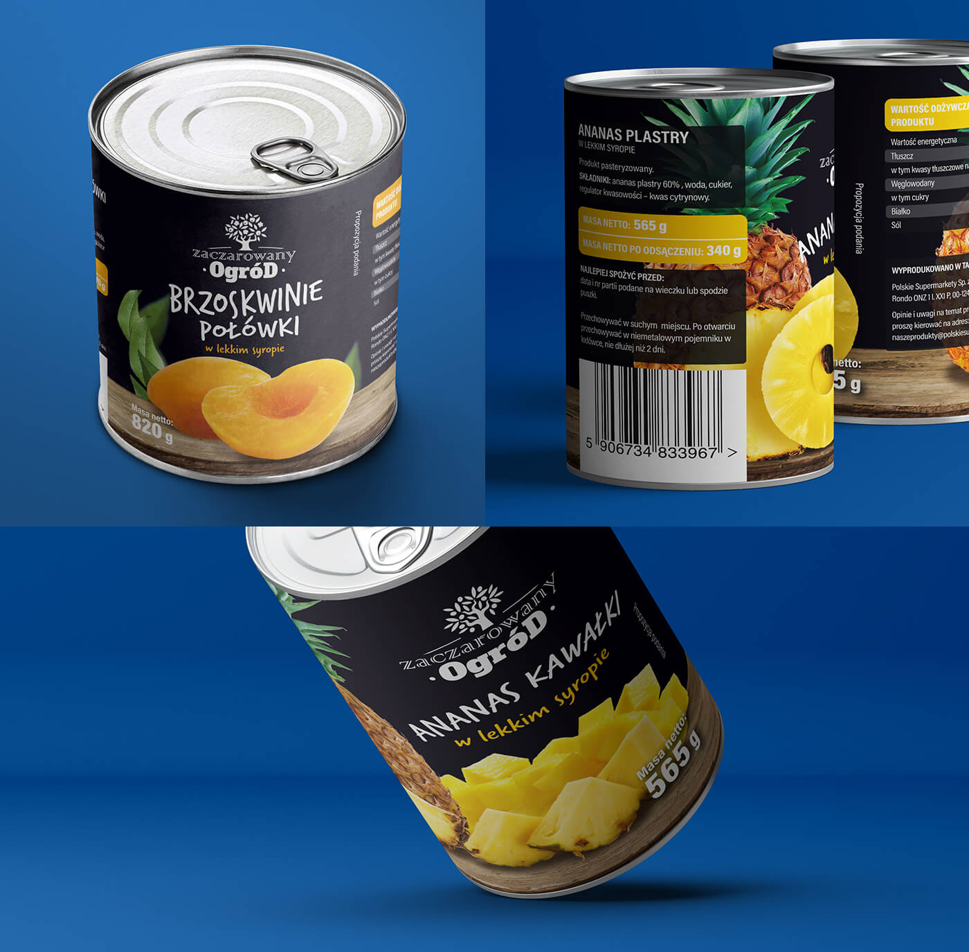
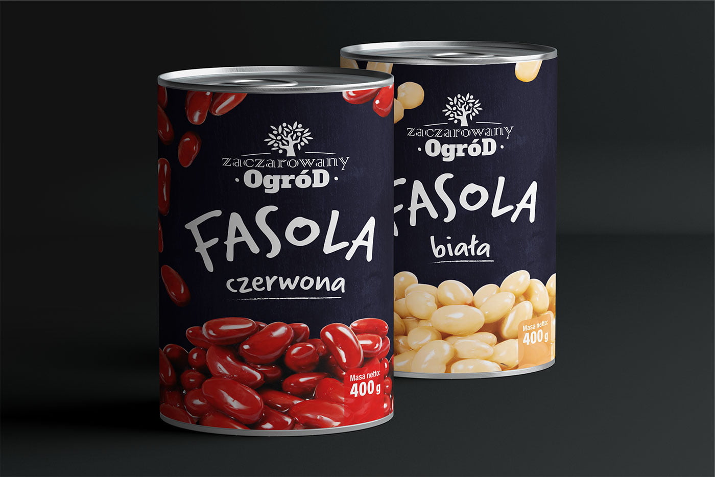
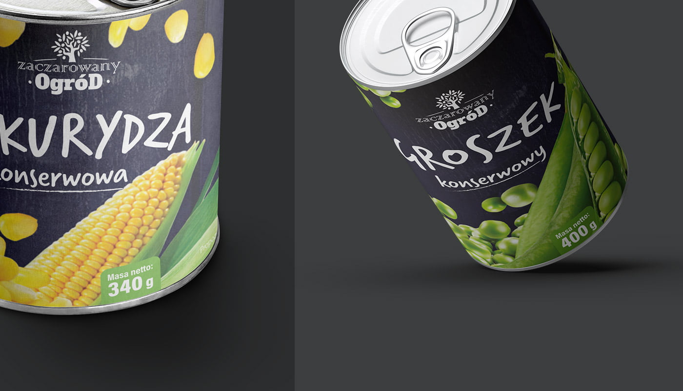
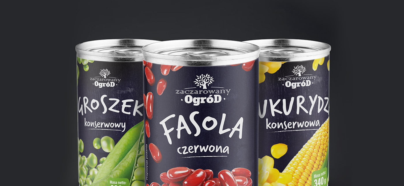
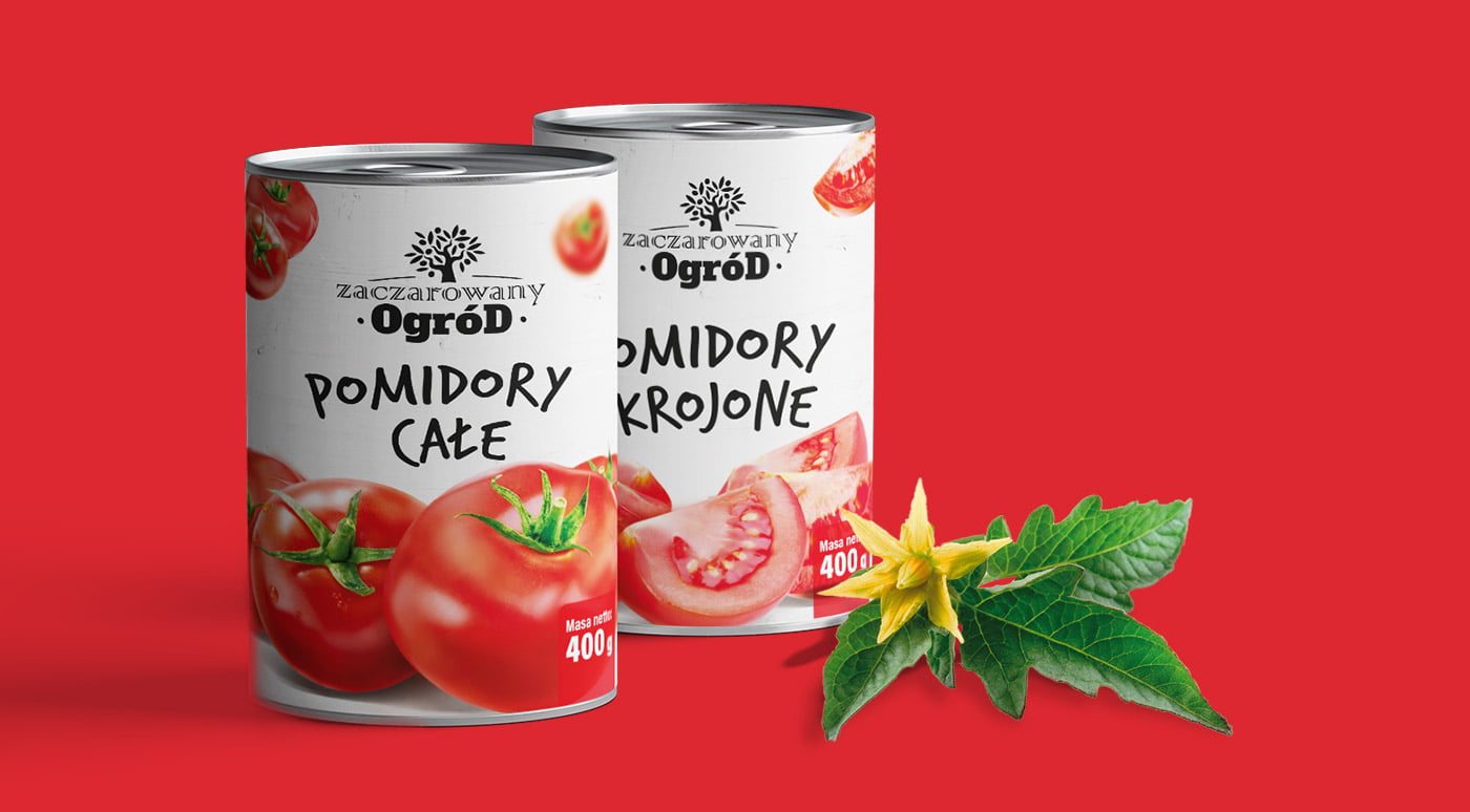
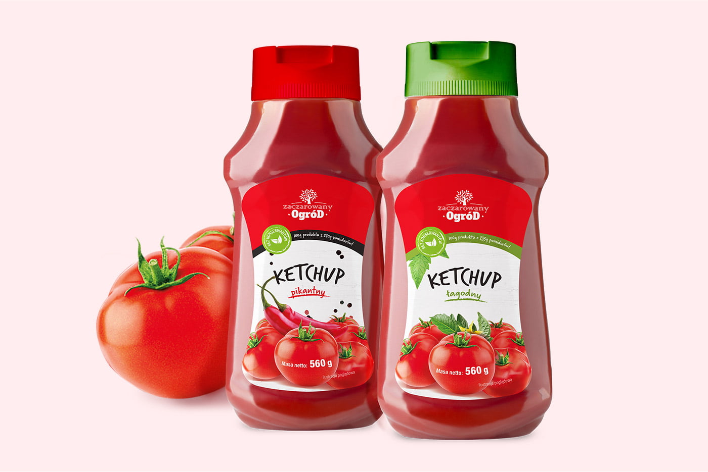
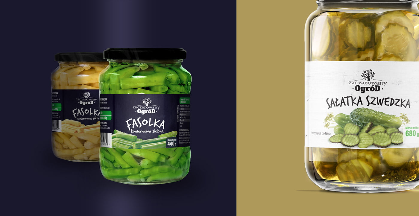
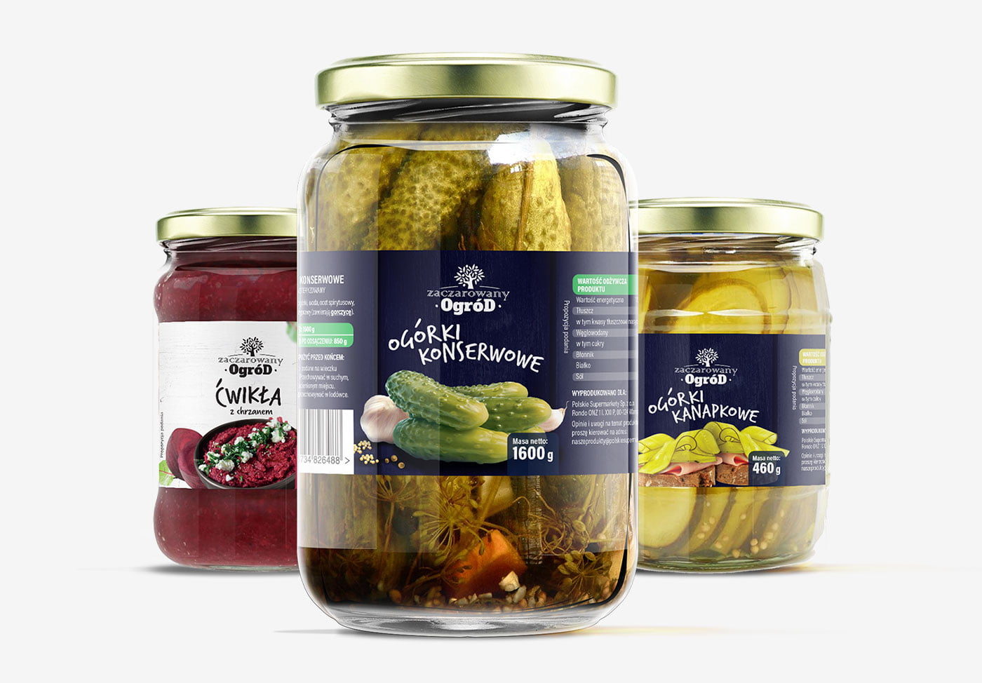
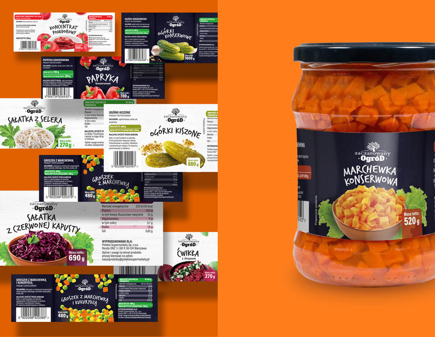
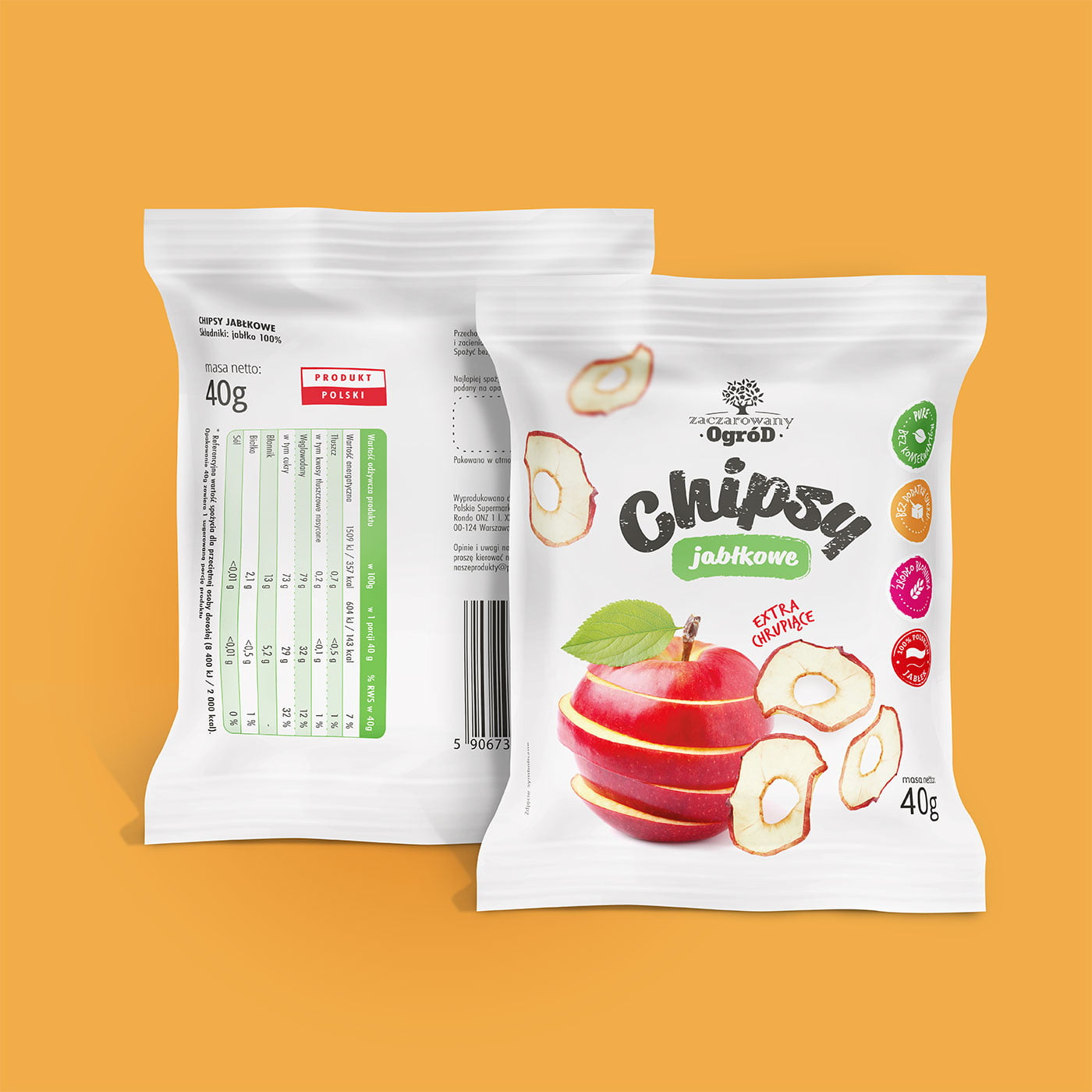
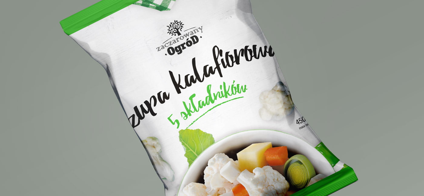
Designing for private label is a multi-level task. There can be different product lines under one brand and each of them needs to have a coherent graphic design. In consultation with the client we worked out two main design backgrounds – navy blue and white. We wanted the products to differ from the competition by simplicity and eye-catching accents. We wanted to expose the content on a minimalistic background, so vegetables and fruits are in the foreground, and the background does not compete with them.
Year of implementation: 2017-2018
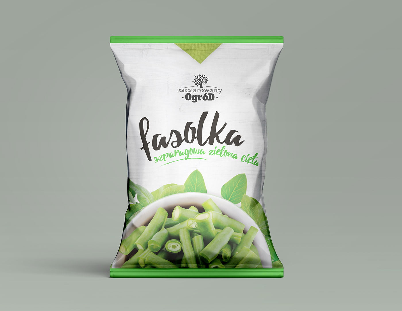
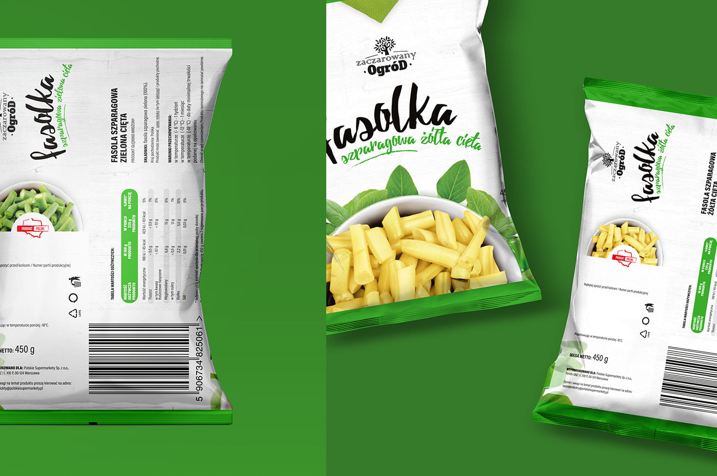
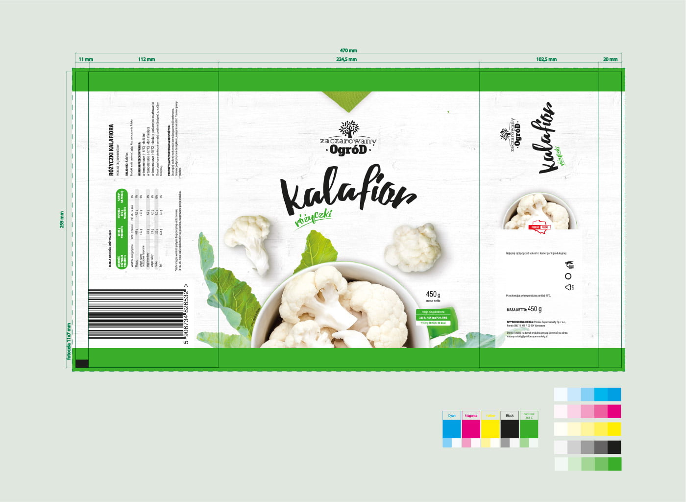
Composing a layout on labels that are can wrappers should assume how the design will behave when wrapped. Will the elements that are important be in the right field of view while seamlessly transitioning to the side of the design.
