

We know how to color the world anew. At least our client’s small world.
REBRANDING
– The new life of your brand
The Challenge: In 2017, we took on the task of refreshing the Castellari brand. Initially the goal was to create a new website layout, but looking at the Client’s profile, together with the Client we saw the need to modify the Castellari brand thinking. Development of visual communication, web advertising, social media as a means of reaching the Client, forced changes in the brand presentation. Our task was to create a coherent, light identification supporting such areas of communication with the Client as: website, social media, coffee shop.
Results: Simplified logo, new website, social media templates, café materials (menu, takeaway packaging, wall graphics).
Logo
First on the wallpaper went the logo. Previous version referred to the flag of Italy, we opted for mono-color. We aimed to modernize the logo, leaving almost the same typography. We resigned from using three colors because, although based on Italian techniques, Castellari ice cream is a Polish brand. We have chosen colors associated with sweetness and lightness.
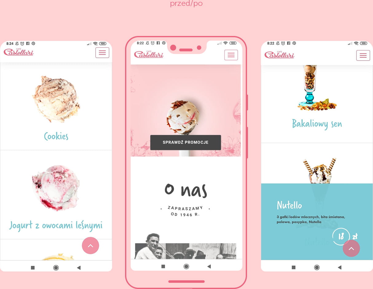
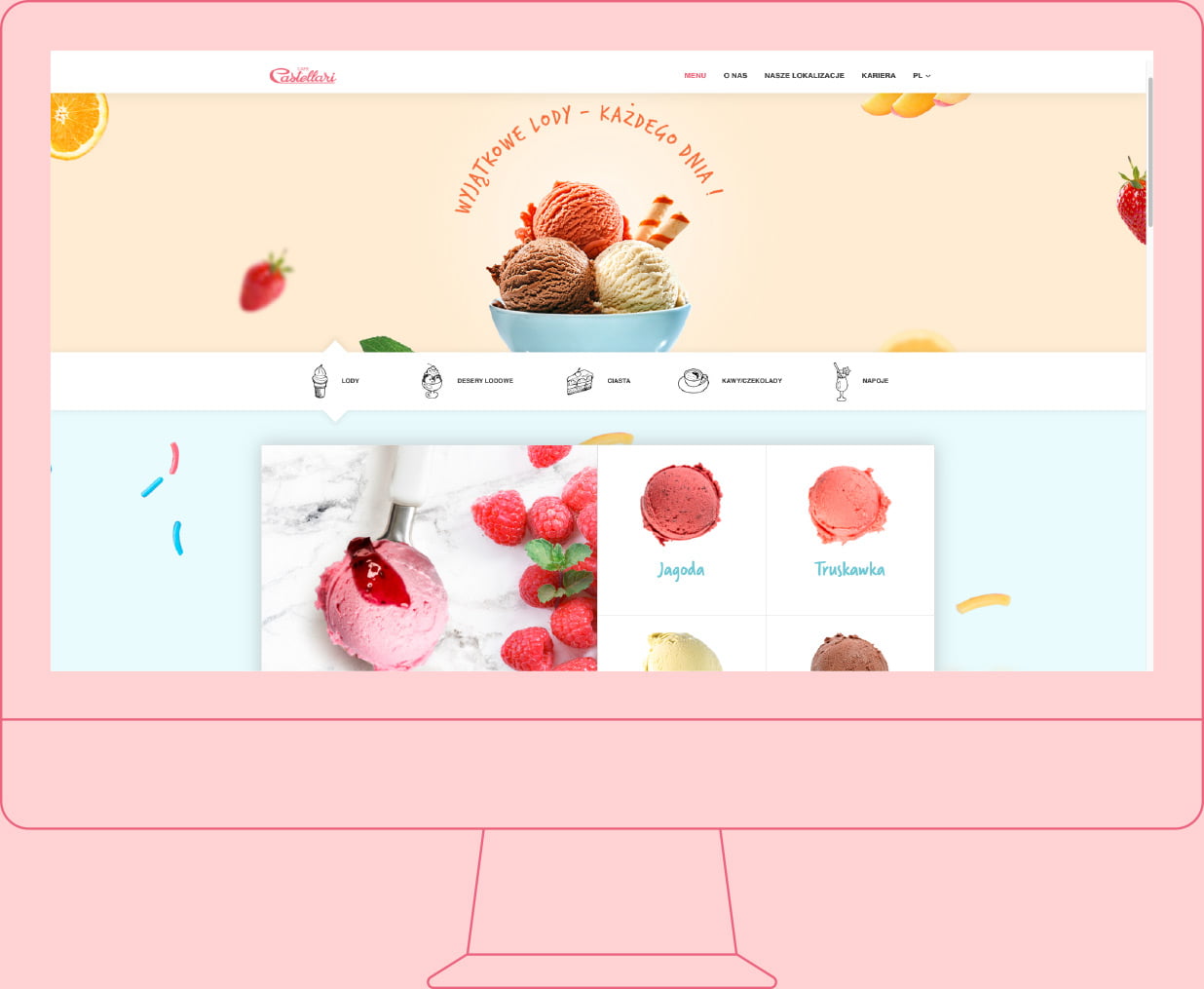
Web design
The next step was to design the website. The previous version of the site rather represented the standards of the previous decade, so it was necessary to develop a new strategy in accordance with the UX, design the traffic on the portal and give the website an overriding function. The result of these actions was, among others, exposing the offer – i.e. the menu of the restaurant, which is the dominant feature of the whole website.

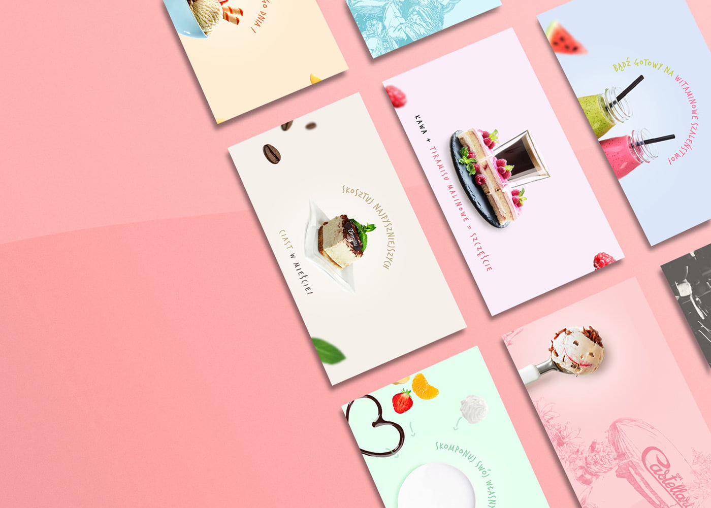
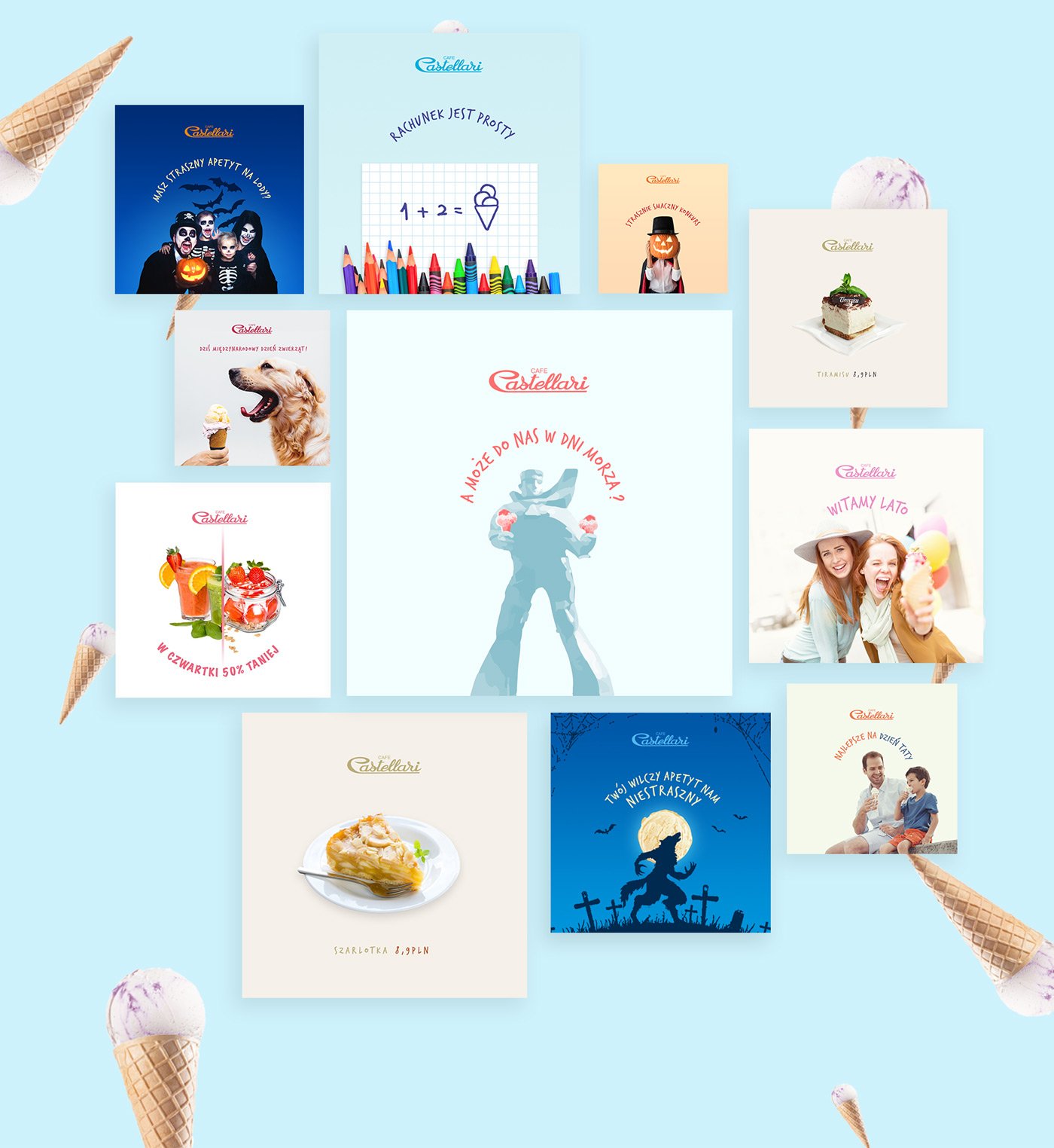
Social Media
A collection of templates for posts, cover photos
Design Lokale
There is no restaurant without a decently designed menu. Our task was not only to prepare the graphic composition, but also to choose the appropriate material on which it will be printed. For our client the most important thing was the durability of the menu and its resistance to splashes. We tested different types of papers, laminates, and even printing on synthetic paper. In the end, our customer decided to print on 300g chalk with a double-sided laminate on each card.
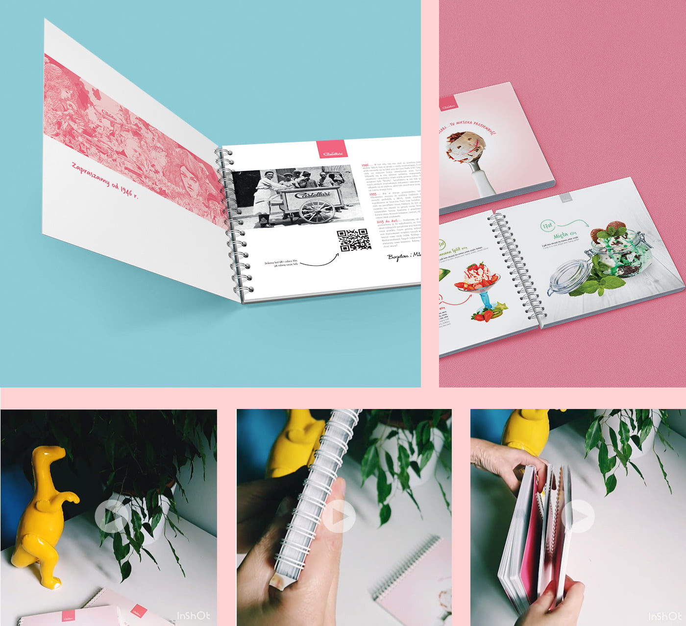
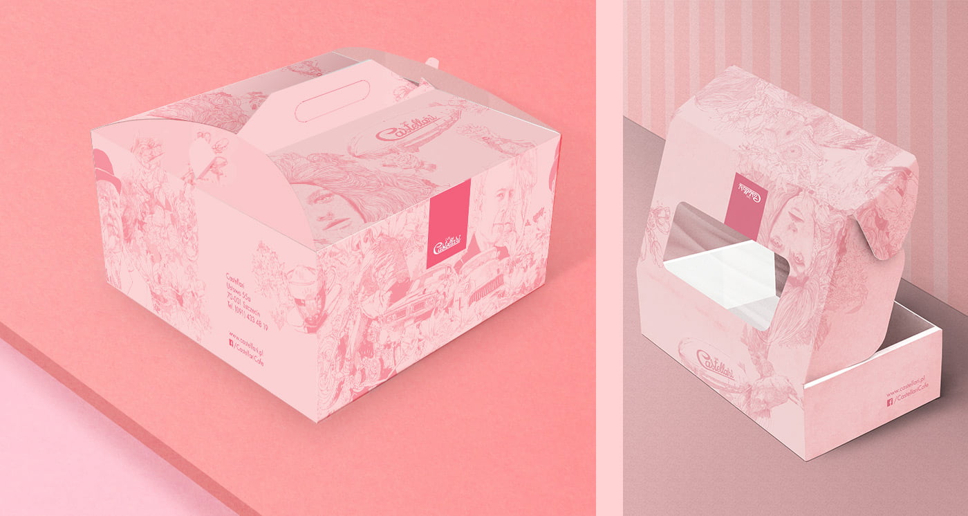
In addition, we prepared personalized takeaway packaging, consistent with the new color scheme and using the brand’s characteristic graphics (present on the walls in the premises and adapted to the designs in the new color scheme).