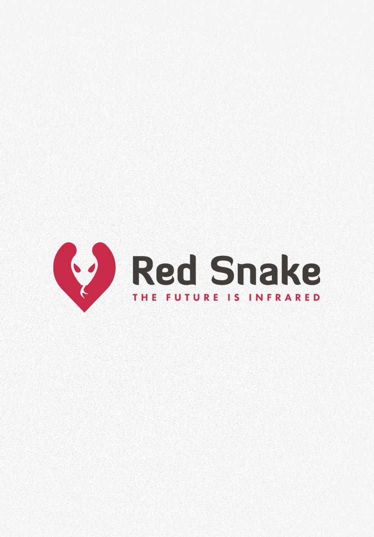
We started our collaboration with Red Snake in 2016 by rebranding the logo, creating a brand book and setting the direction for further graphic design activities.
Design is the silent ambassador of your brand.
Paul Rand
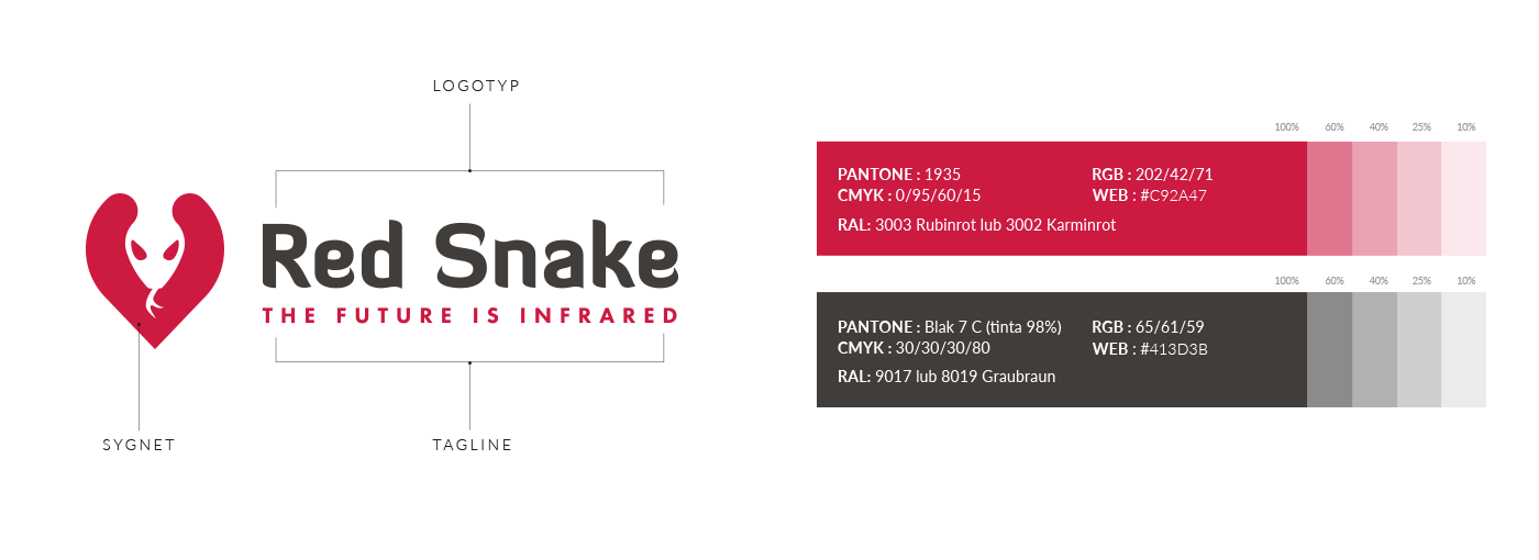
The starting point for designing the new shape of the logo became the signet. We wanted it to be still a snake head, but set in a simplified shape. We also introduced new typography of the sign, using a font with characteristic serifs (resembling a snake’s tongue). The logo is complemented with a claim written in classic sans-serif typeface. Another important element in the process of brand refreshment was systematization of rules and relationships in the form of the Logo Book. Such a document allows different teams to create consistent materials for a given brand. It is a starting point for designing letterhead, business cards or offer folders.

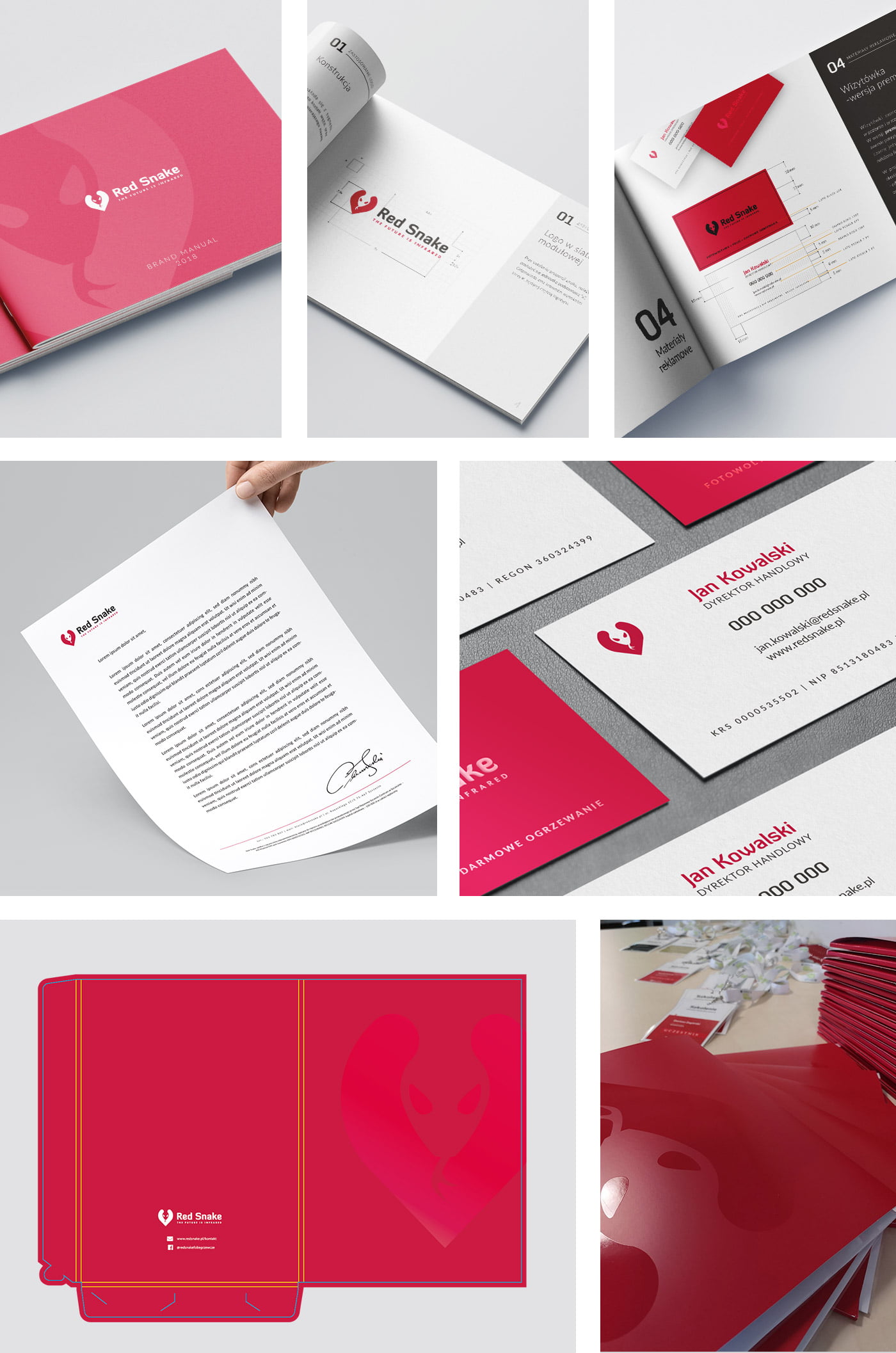
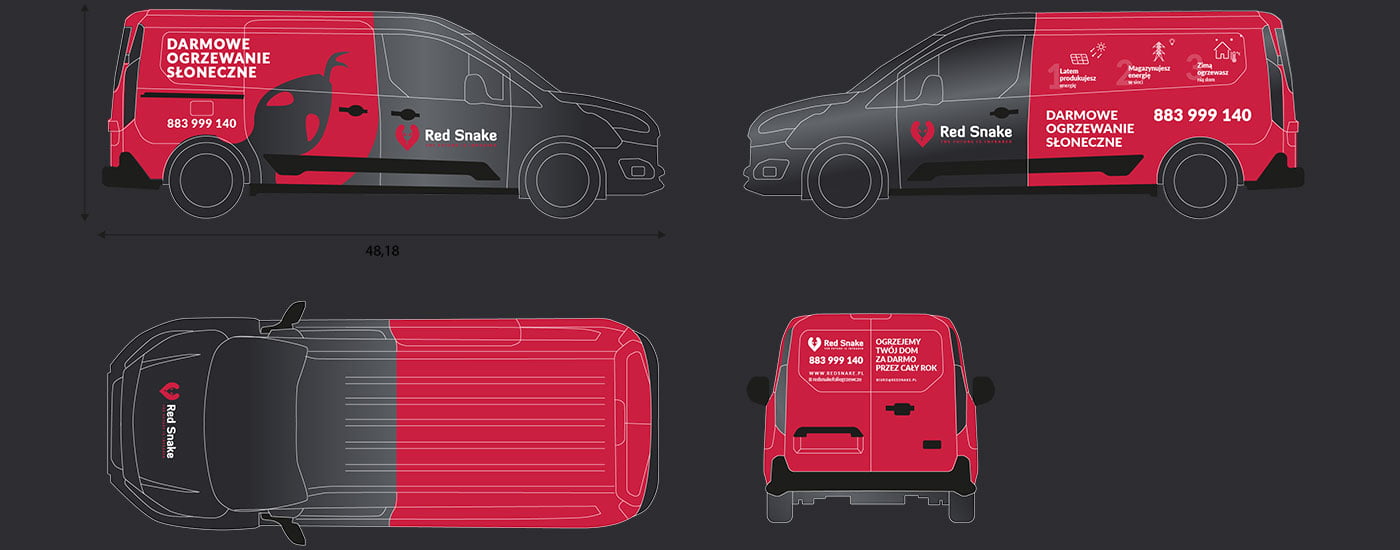
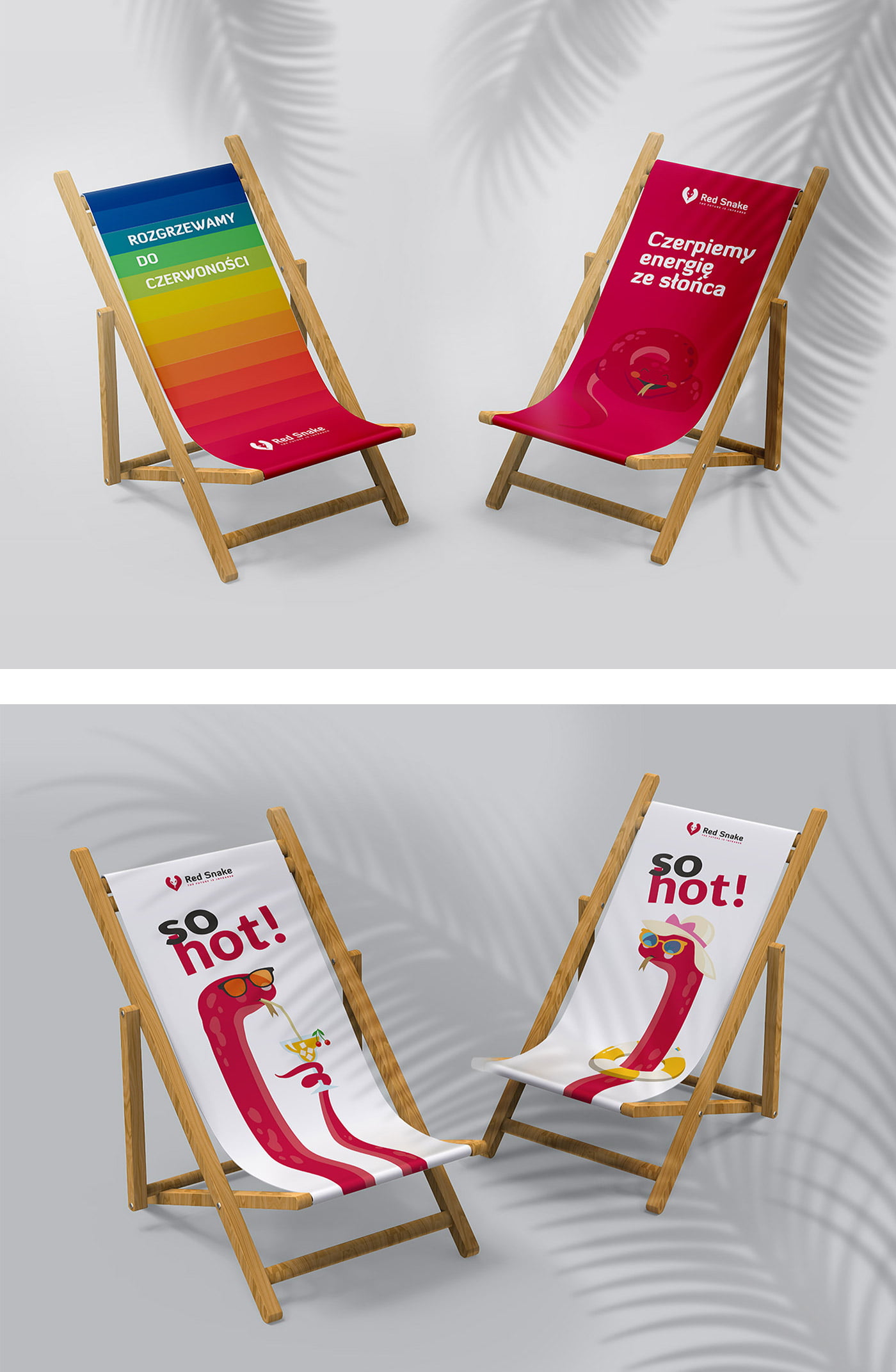
It is also a signpost for more avant-garde activities, such as car wrapping design or advertising gadgets.

