
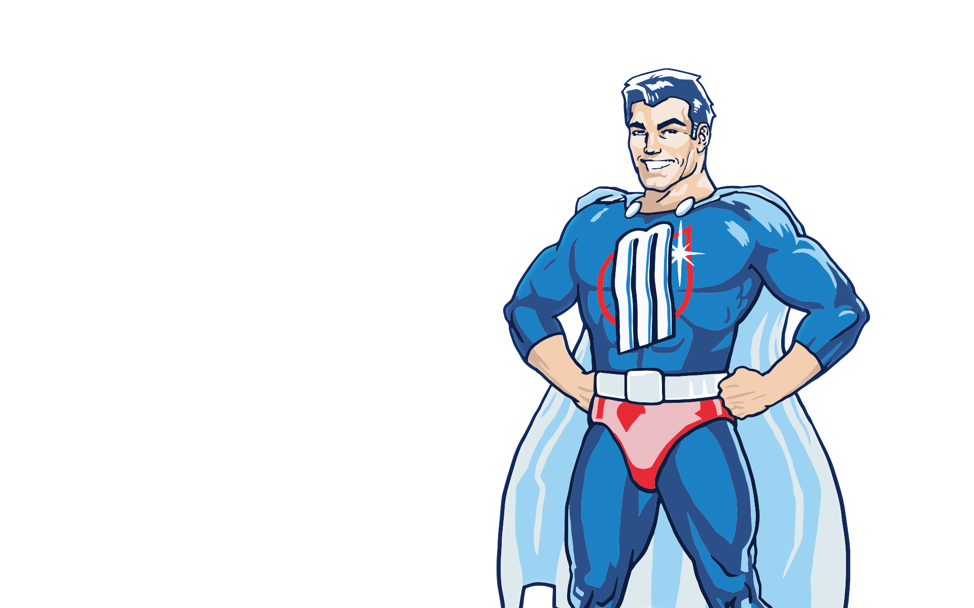
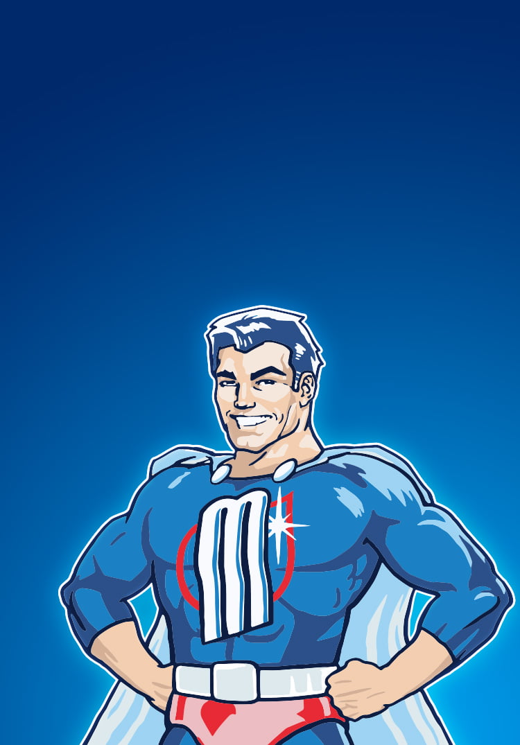
When we get down to cleaning, it has to be efficient.
And it’s faster to clean with a helper. That is why he was created – a superhero.
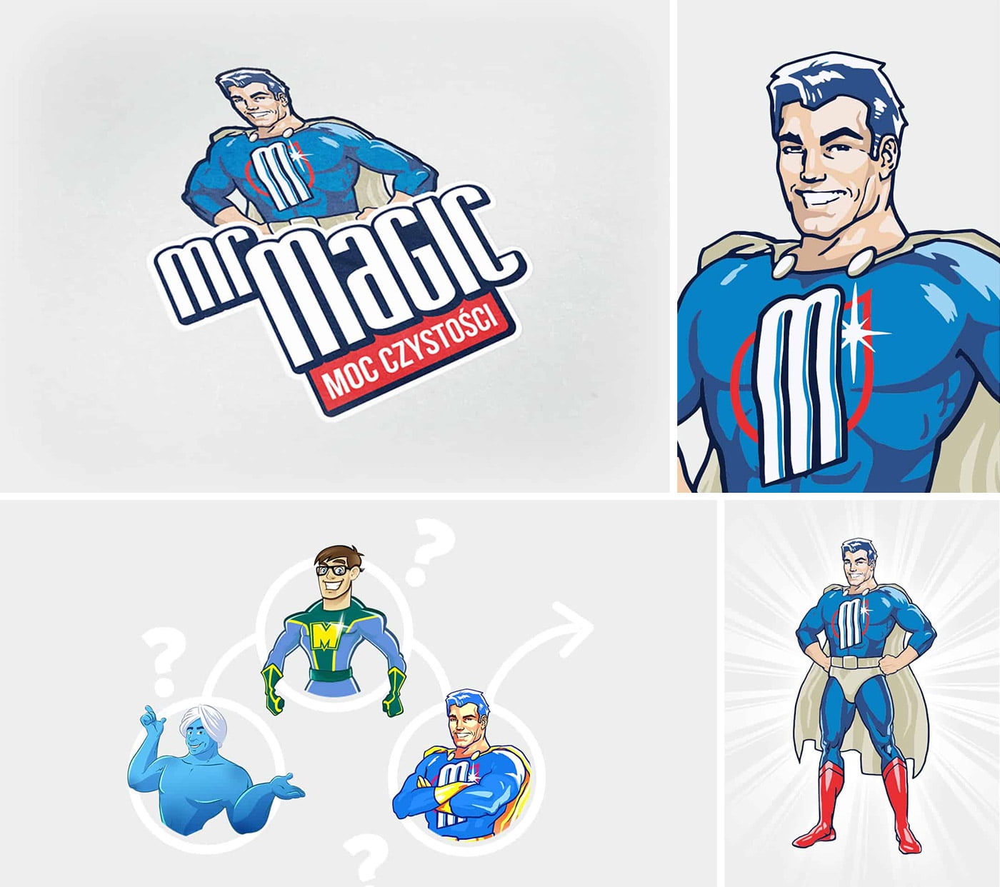
We fulfilled our three assumptions,
It was supposed to be simpler, more modern
and friendlier in perception.
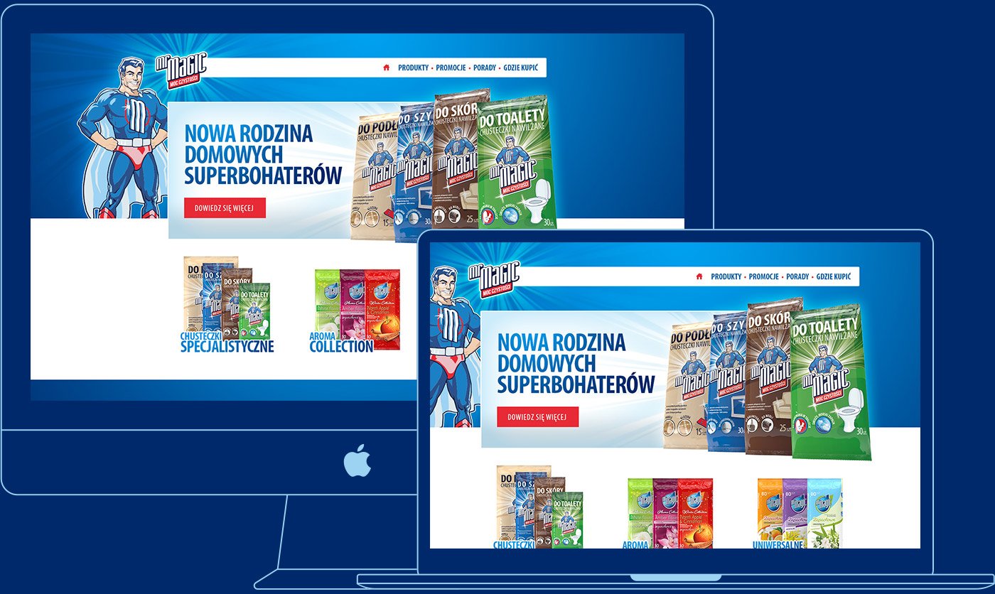
Challenge: Reach consumers with the new brand of Mr Magic cleaning products and Queen hygiene products, including Queen Kids, which are on sale in Biedronka stores.
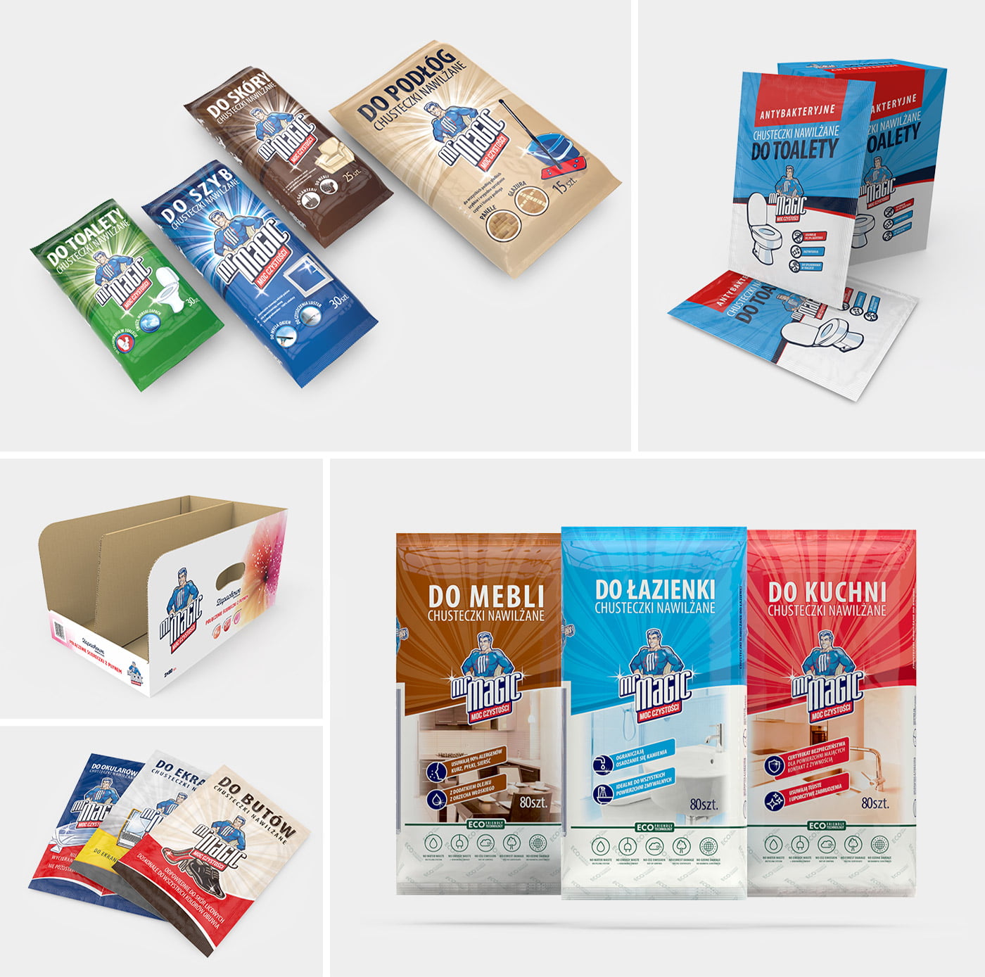
The answer to the challenge was a new visual identity. A beautiful design, adapted to the gender and age of the target market. Mr Magic cleaning products are distinguished by a brand superhero – durable, strong and effective, reliable in every cleaning, always at hand and ready to work.
To strengthen the brand, not only the soft packaging got a new look,
but also cartons for storing the products on the store shelves and the website.
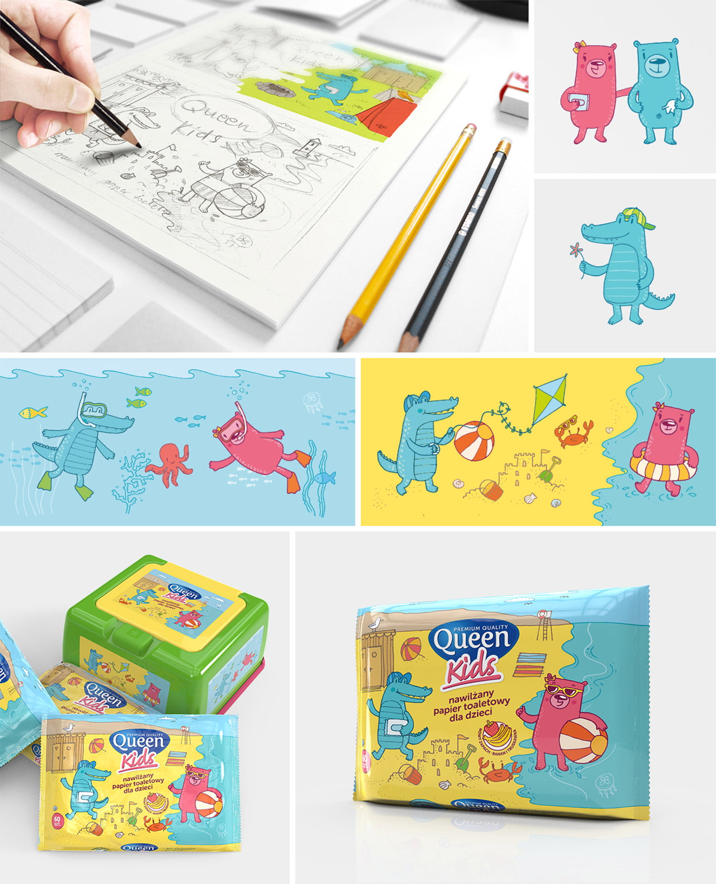
It was quite a challenge for us to design the packaging of the Queen Kids brand. Children are the most demanding customers, because they spontaneously and honestly react to what they see. We began the design process by meeting with young consumers. Together we chose the target group’s favorite animals and invited children to draw. Based on this, our illustrator made several sketches of the characters and set them in situational scenes. The result of the joint work was submitted to an independent test group, which chose the most interesting drawings in their opinion. On this basis we created the final project, which was a great commercial success, resulting in the sale of the entire stock of the product, which was delivered to supermarkets within a few days. As part of the campaign we created a set of coloring books, puzzles and simple board games added to the products.